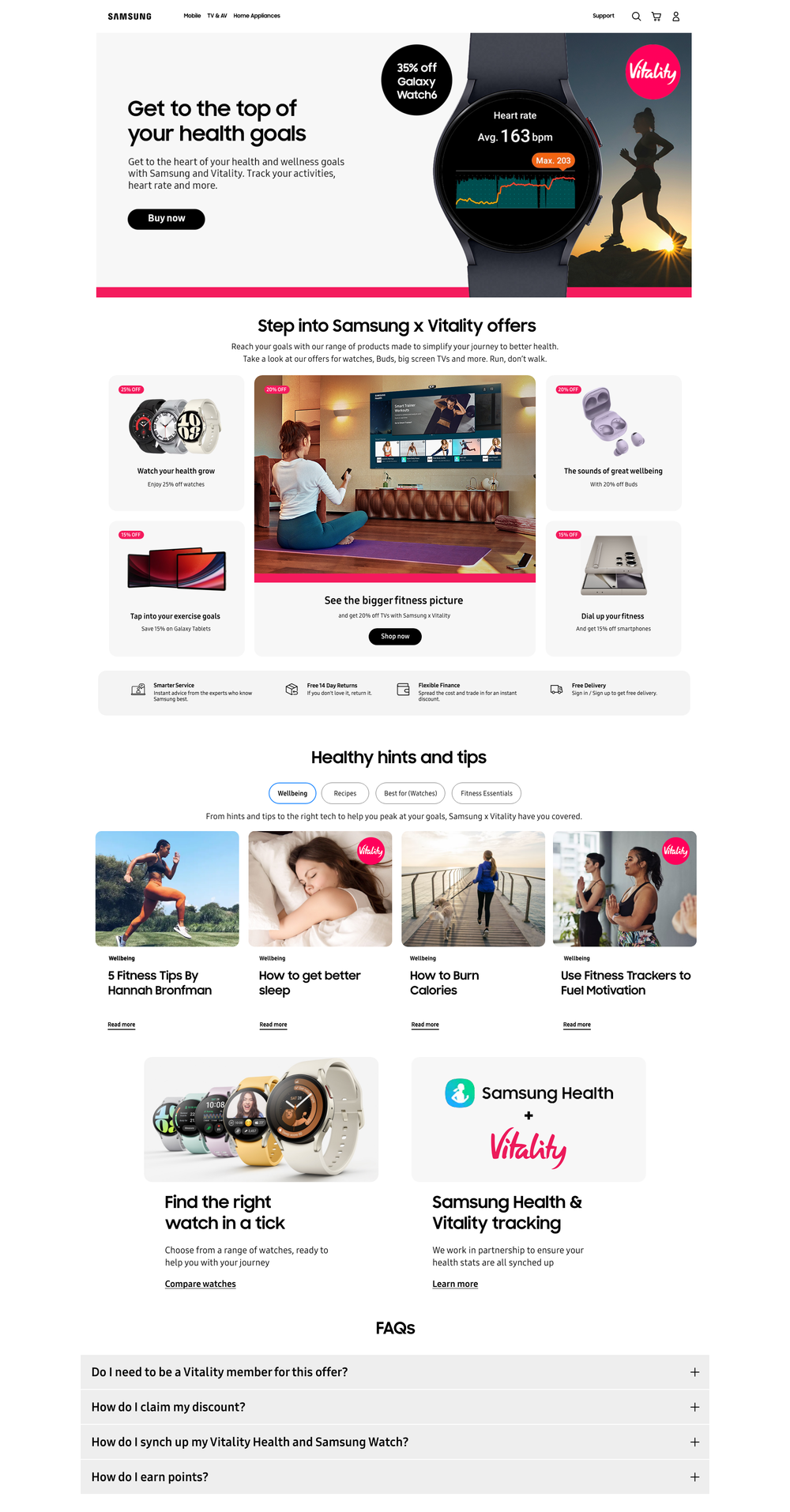
Samsung x Vitality -Members Hub
I was briefed into designing a web page for Vitality members on Samsung. The challenge was blending of the two brands where I went with a 70/30 (Samsung/Vitality) approach.
This included working with Samsungs co branding guidelines teams and with Vitality’s guidelines.
I was paired with a copywriter. We didn’t want to just tell a story with the copy but visually too.
Below are the two routes I presented to Samsung clients and Vitality.
Route 1 was called Move Forward and Route 2 was called Reach Rise

Route 1 – Move Forward This route is light touch branding from a Vitality point of view with the use of imagery which works in partnership with punchy, emotive and motivational copy, tying it all together.

Route 2 – Reach/Rise This route uses the Vitality branding in a bolder way. The pink abstract shape is to show upwards momentum (Rising). The use of lifestyle imagery has been picked to work hard with the headline copy, which playfully reflects the design.
Client(s) moved forward with Route 1 which is still being added to and updated following the same creative.


